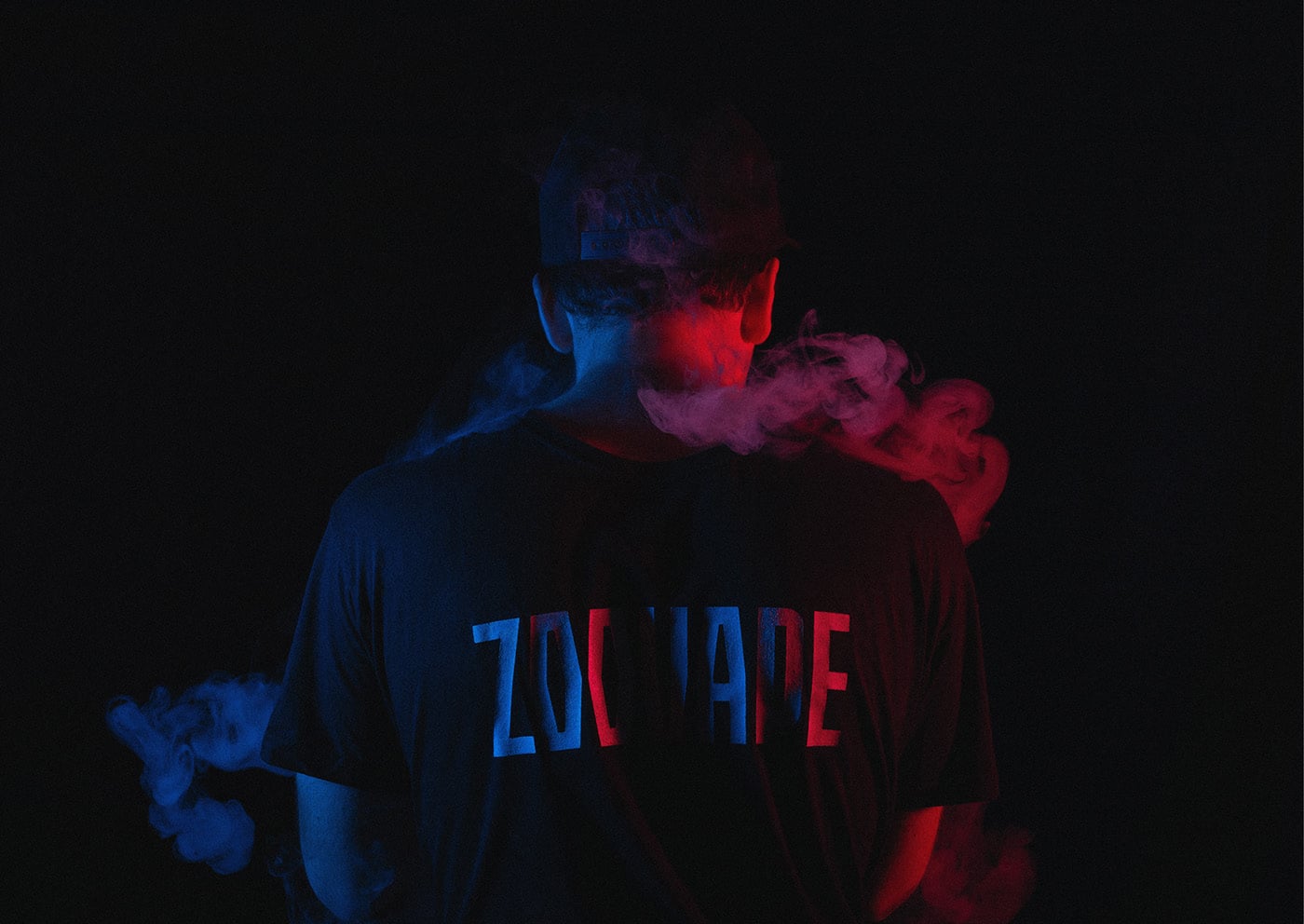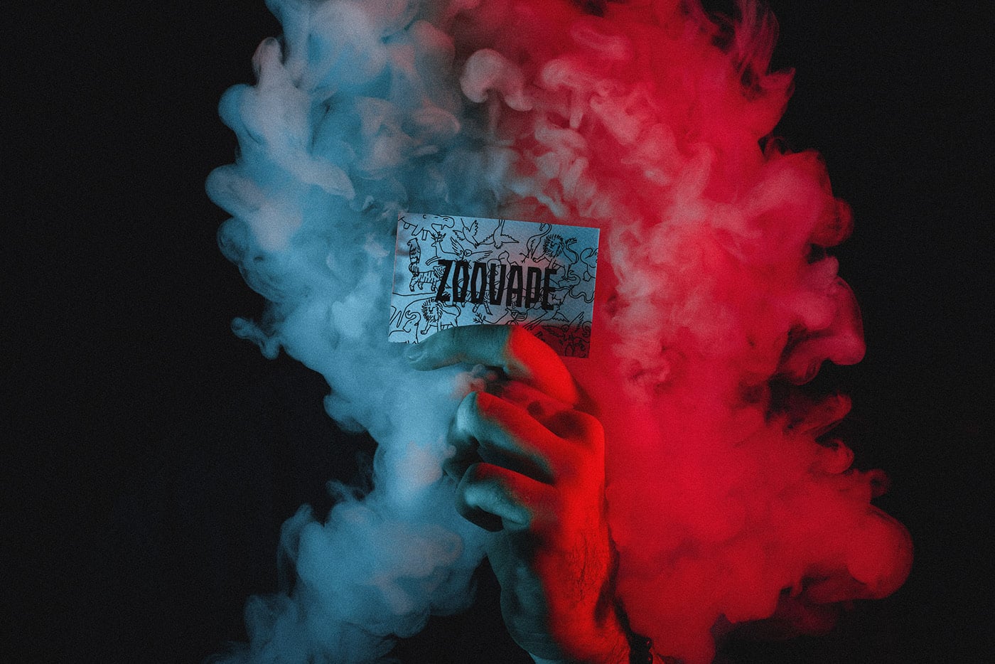
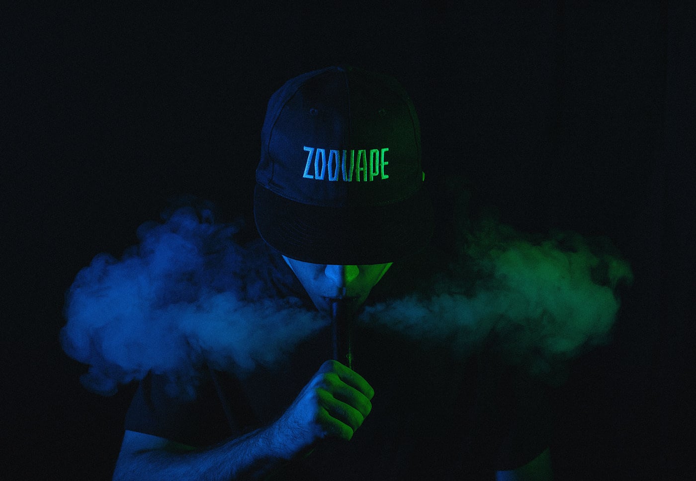
With an urban approach, free of rules, a visual system filled with textures and vibrant colors, the brand finds distinction and invites the user to discover each of ZOOVAPE’s essences.
The goal was to create the visual identity and its products —a family of labels where each flavor is identified through a color and an animal with related characteristics.
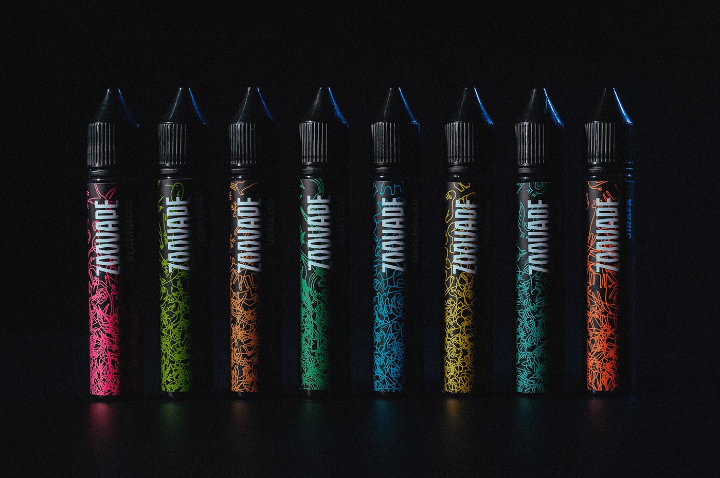
The textures are the result of the superposition of each animal in different stances, reinforcing the concept of discovery throughout the brand.